Overcoming my Irrational Fear of
Texturing!
(please note that the textures I use
are free to use from various FREE TEXTURE sites. I will produce a blog post giving
credit once I have finished using them)
Today at uni I began to texture the bookcase asset for
my scene. I was so irrationally scared to start it and I have no idea why, when
I got going it was really fun, time consuming but genuine fun! With the ambient
occlusion and UV snapshot in Photoshop I had to add a mid tone grey base colour
underneath both the layers to ensure my textures weren't completely
exaggerated. I then began with the first base texture.


However, this texture looked awful. It’s grungy and dark
just how I need it to ensure its associated with my game design document but
there just isn't enough detail, it looked too flat. So I asked Lothar and he
said that I needed to tone down the saturation because it looked overly grungy
and too bright. With this in mind, I took to Photoshop with various textures
and started combining them to try and enhance the wood texture.
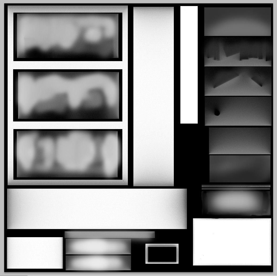
I used a variety of layer settings, opacity changes,
erasers, hue/saturation's, vibrancy's and other tools in Photoshop to acquire
the right look for the wood. Here’s the
process I went through to create the main wood texture.


At this point I decided to apply the texture onto the
bookshelves to see where it needed more work. Here is the render.


After I showed Lothar my progress he said that it still
needed a lot of work, I needed to enhance the broken wood quality, adding
cracks and splints to express how this bookcase wasn’t just “normal”. So I went
back to Photoshop with new textures and kept editing the image. I started to
find textures with cracks and more detail that I needed to apply.


With this new detail added into the wood, I did a fresh
render in Maya to see how it they
looked.

Even though this was an improvement on the previous
version I still knew I had to add more
detail to ensure my asset was believable but also retained its likeness to
Distorted Delirium. I decided to take Lothars advice further and add old
newspaper scraps into the texture as if someone had done a bad fixing job…I dunno, Lothar seemed to
think it was a good idea so I just went with it >:D


Despite my best efforts I thought I had recorded images
for all my renders, alas I am missing the one where I added the newspaper
textures on their own so I am going to have to skip onto the next part which
was assigning the wood texture I had created to the correct areas of the UV
snapshot and ensuring that the ambient occlusion didn’t make them entirely
black.


When it came to assigning textures to the other parts of
my diffuse map I realised that parts of my ambient occlusion made the texture
appear black. To fix this I had to manually paint over the dark areas, on
Photoshop, using a lighter grey colour so that the textures would actually show
up correctly. With the ambient occlusion
slightly altered I was able to apply the rest of my textures and finish the
model (for now).
Top is before, bottom is after.


As you can see after I adjusted the ambient occlusion
values my textures popped and also had more depth. I did another render and
here is the outcome.


Thinking ahead to producing specular maps, I thought it
would be cool to use the blood splatter paint brushes I downloaded for
Photoshop for the last project. I figured I could add a couple of blood
spatters onto the textures and produce a specular map so that they appear
glossy as if the blood was really there. Just a thought :) For now, I am
really happy with the outcome of my bookshelf!! YAY!

No comments:
Post a Comment